SPIP enables the automatic extraction of a colour from an image so that it can be applied to other elements of the interface.
For example, beside the logo of an article, we could display the title of that same article in one of the colours extracted from that logo. In this way, while not only making the displayed pages more varied (from one article to another, the colour used will change depending on the logo), the fact that the colour is extracted directly from the image ensures a certain graphical consistency.
The following function, which consists of retrieving a colour from an image, is complemented by a collection of other functions that make it easy to manipulate that colour, principally by darkening or lightening that original colour. The list of such functions is quite long, which allows you to achieve a significant number of different effects.
couleur_extraire
Starting with an image (logo for an article, logo for a section..., but also any images in a portfolio), we can ask SPIP to extract a colour.
[(#LOGO_RUBRIQUE|couleur_extraire)]
Attention: this does not entail SPIP determining the dominant colour from the image, but only of extracting just one colour from that image. For that colour to actually be "representative" of the image, the image is first reduced to a maximum size of 20 pixels; this makes the various colours in the image relatively "averaged". This value of 20 pixels is quite experimental in nature: it is sufficiently small to avoid extracting a colour that is not common in the image; and it is sufficiently large to avoid the extracted colour being systematically "grayish".
Used without any parameters, the couleur_extraire function returns a colour located slightly above the centre of the image. It is possible to indicate a preferred point for the sample if you wish by passing two values, (x and y), ranging from 0 to 20 (recommendation: use between 1 and 19 to avoid margin effects).
For example:
[(#LOGO_RUBRIQUE|couleur_extraire{15,5})]
returns a colour located above and to the right of centre of the image.
To better understand the principle, we will apply this filter to a logo of uniform colour:

The result is: ff9200.
Note: the values returned are systematically coded in hexadecimal RGB format, and do not include the "#" which normally precedes such codes. So you need to remember to insert this hash sign when you actually use the extracted values.
For example, we could apply this colour to the background of a div block:
<div style="[background-color: #(#LOGO_RUBRIQUE|couleur_extraire);] width: 100px; height: 100px;"></div>

Applying this filter to a photograph:
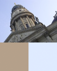
On the lower left is the colour extracted without parameters, i.e. the colour shown just above the centre of the image (light brown from the building’s stone construction). On the lower right is a colour located on the upper right of the image (light blue from the sky).
[(#LOGO_RUBRIQUE|couleur_extraire)]
[(#LOGO_RUBRIQUE|couleur_extraire{15,5})]
Technically speaking, using this filter is very simple. On the other hand, a certain amount of creativity and inventiveness are necessary to use it effectively... Here are a few use cases:
— colour of the text;
— background colour of a block;
— colour of a typographical image;
— modifying the colour of an image (image_sepia)...
Modifying the colour
Once the colour has been extracted, it can be useful to manipulate it in order to obtain several variants of that colour so as to maintain graphical consistency of a selected "colour chart".
- couleur_foncer, couleur_eclaircir (darken and lighten)
Based on the extracted colour from an image, we would like to display colours that are a bit darker and a bit lighter.
[(#LOGO_RUBRIQUE|couleur_extraire)]
[(#LOGO_RUBRIQUE|couleur_extraire|couleur_eclaircir)]
[(#LOGO_RUBRIQUE|couleur_extraire|couleur_foncer)]
Applied to the colours extracted from the previous examples, this gives:

It’s clear that this is an easy way to obtain shades or hues of a colour in a way that results in the collection forming a harmonious set.
- couleur_foncer_si_claire, couleur_eclaircir_si_foncee (darken if light, lighten if dark)
If we apply the extracted colour to a text block, we need to determine in what colour we would like to write the actual text in that block (e.g. black on orange, or white on orange); which is what we will obtain with these next two functions.
For the moment, let’s decide that the text will be of a given colour. We would like, for example, that the text is black. We would therefore need to choose the background colour depending on this black text: for the text to be legible, we will need a light-coloured background (viz: black text on a light background).
If we apply the couleur_eclaircir filter to our extracted colour, we have two cases:
— if the colour is dark, then it will be lightened and we will obtain the desired effect;
— if the colour is already light, then we will lighten it even more, and we will obtain a background that has become almost pure white. In such a case, since the colour is already light, we would prefer to use it just as it is.
This is where we apply the filter couleur_eclaircir_si_foncee (lighten colour if dark):
— if the colour is dark, we will lighten it;
— if the colour is light, we will use it as is.
The couleur_foncer_si_claire (darken colour if light) function works in the logically opposite direction. It is very useful, for example, to write text in white on a darkened background, but to avoid making the result an almost solid mass of black if the original background colour was already dark.
- couleur_extreme, couleur_inverser
The couleur_extreme filter switches a dark colour to black, and a light colour to white. This is useful for writing in black or white on a coloured background.
In reality, retrieving the "extreme" colour is normally used with couleur_inverser, which inverts the RGB colour. It specifically transforms black into white, and white into black.
In practice, this can ensure better contrast, regardless of the background colour of the block (whereas in the previous example, we chose the background colour depending on the text colour).
When applied as a background colour, here is the colour extracted from the image:
<div style="[background-color: #(#LOGO_ARTICLE|couleur_extraire);]"> ... </div>
So depending on the article’s logo, we therefore obtain either a dark or light background.
When applied to the text colour, here is the extracted colour in its "extreme" shade:
[(#LOGO_ARTICLE|couleur_extraire|couleur_extreme)]
— When the colour is dark, the extreme colour is black, and we will be writing in black on a dark background.
— When the colour is light, the extreme colour is white, and we will be writing in white on a light background.
In both cases, the result is barely legible. But we could use this colour for another effect (e.g. a border around the div block).
So what we still need to do is to invert this colour to apply it to the text;
<div
	style="[color: #(#LOGO_ARTICLE|couleur_extraire|couleur_extreme|couleur_inverser);]
		[background-color: #(#LOGO_ARTICLE|couleur_extraire);]">
			...
</div>
— When the extracted colour is dark, the extreme value is black, and its inverse is therefore white. We will be writing in white on a dark background.
— When the extracted colour is light, the extreme value is white, and its inverse is therefore black. We will be writing in black on a light background.
In both cases, the resulting contrast ensures better legibility.
The couleur_extreme filter accepts an optional variable ranging from 0 to 1 (by default: 0.5), to regulate the luminosity threshold which will cause a switch between black and white.
- couleur_saturation (SPIP 2.0), couleur_luminance (SPIP 2.1)
These next two filters are intended for creating shades of colours with complete control over the subtleties of shading and by forcing a result based on an absolute scale (whereas the previous filters generate a result relative to the original value).

The couleur_saturation filter allows us to range over the saturation values of the colour:
— |couleur_saturation{0} returns white,
— |couleur_saturation{1} returns the colour with its maximum saturation (which is not black, unless you start with a pure grey),
— between the values of 0 and 1 lies the full range of saturations of that colour.
Playing with the saturation allows you to obtain extremely finely differentiated results from a single colour, without introducing any "grey" effects to that colour (an orange will never become brownish, a green will never become "greyed"...). On the other hand, the maximum value is a "pure" colour, the luminosity of which can vary widely (blue in its maximum luminance is very dark; yellow in its maximum luminance remains light in nature).
The couleur_luminance filter allows us to range over the luminosity values for the colour:
— |couleur_luminance{0} returns white,
— |couleur_luminance{1} returns black,
— |couleur_luminance{0.5} returns a variation of the original colour with an average luminosity.
With this function, it’s easy to play with the range from 0 to 1 in an easy-to-apply manner: it always entails running from 0 to 1 and guarantees passing through the original colour. The final results are much easier to predict: with a variable value between 0 and 0.5, we will always obtain a light colour, and from 0.5 to 1, it will always be a dark colour.